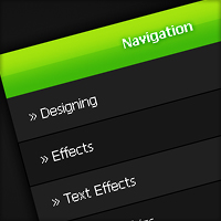
Dark Navigation Menu
In this tutorial I’ll be teaching you how to create a dark menu box using mainly the marquee tool.
Step 1
Start a new document 600 by 420 pixels and fill with a dark radial gradient using the colours #181818 and #040404.

Step 2
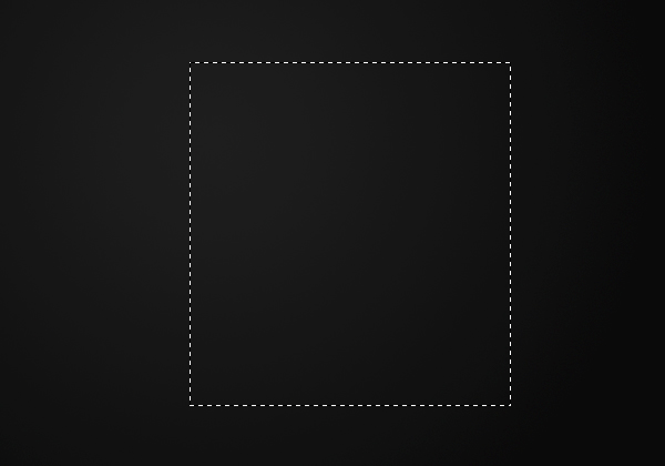
Create a new layer (Layer > New > Layer) and using the rectangular marquee tool make a selection of 290 by 310 pixels in the center of the document.
Step 3
Fill the selection with the colour #202020 by going Edit > Fill.

Step 4
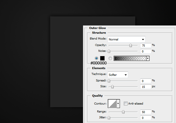
Apply this outer glow to the layer by going Layer > Layer Style > Outer Glow.
Step 5
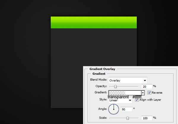
On a new layer make a selection of 290 by 40 pixels and fill with a linear gradient from #8ddc0c at the top to #40b80a at the bottom.

Step 6
Apply this gradient overlay to the header background by going Layer > Layer Style > Gradient Overlay.
Step 7
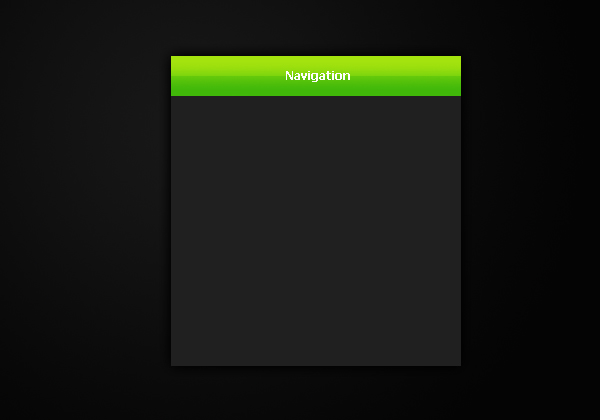
Add in some text for the header using the text tool.
Step 8
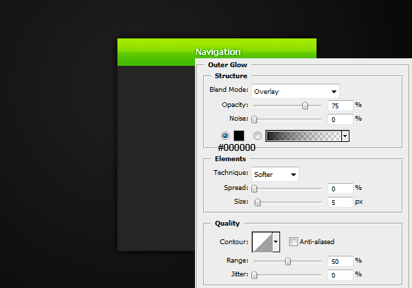
Add an outer glow to the text so it is easier to read.
Step 9
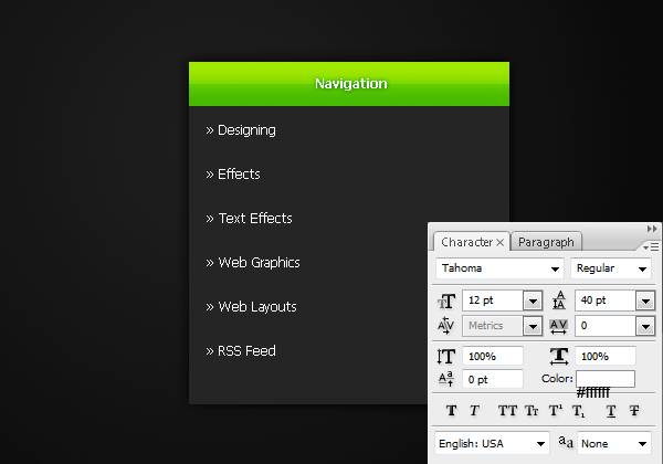
Select the text tool from the tool bar and add some text for the links.
Step 10
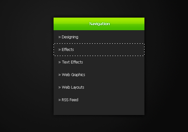
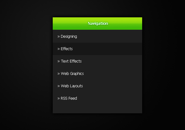
Select the rectangular marquee tool and make a selection of 290 by 40 pixels behind the second link.
Step 11
On a new layer fill this selection with the colour #171717 by going Edit > Fill with colour.
Step 12
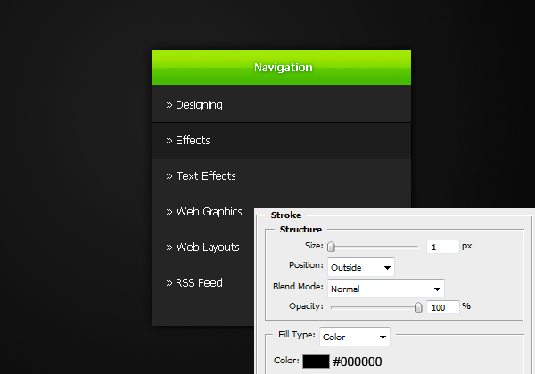
Apply this stroke to the layer by going Layer > Layer Styles > Stroke.
Step 13
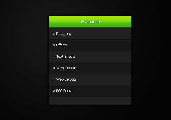
Duplicate this layer and move it down to the 4th link, and the same for the last link. To turn this photoshop file into a fully functioning html file check out the code part of this tutorial.


Nice tutorial!
very nice very nice i like to web design
mani
its very nice tutorials
keep up the good work.
Nice tutorial, thank you!
Really, really nice! Keep up the good work!
Thanks guys, it’s appreciated :)
Thanks for sharing, nice tutorial
Great tutorial, I don’t know if its just the way the images show up on the web or what but the colors you provided show up as light browns kind of for me. Of course it is not problem because I could use my own colors of course I was just curious as to why they show up as brownish for me. Are the colors you used a light brown? Because the colors I see on the images here are light gray and black but in PS theyre brown. Thanks Again!
Hi Ryan, thanks. Yes that issue does sound a bit bizarre, I’m not sure what could cause that (they come up as grey on my computers).
I believe it may be just the monitor. I have one monitor where grays have a brown tint to them while my new screen they are gray.
That sounds familiar, it may have happened on my old monitor too.
very good !
A good site, would look great with this =D
Awesome
thx 4 sharing nice tuto :D