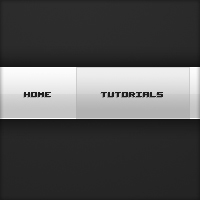
Clean White Navigation
In this tutorial I’ll be teaching you how to make a clean white navigation menu using a couple of layer styles – very generic – great for use in web layouts.
Step 1
Firstly create a new document, I’m just using 600 by 420 pixels like my other tutorials but you might be adding it to a web design so just whatever :) Fill the background with a dark radial gradient, the colours I have used are #2e2e2e and #1c1c1c.

Step 2
On a new layer (Layer > New > Layer) make a selection the width of your document and 50 pixels high using the rectangular marquee tool. Select the gradient tool and set your foreground colour to #fafafa and background to #c4c4c4. Fill your selection with a linear gradient from top to bottom.

Step 3
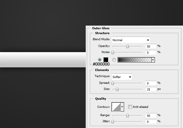
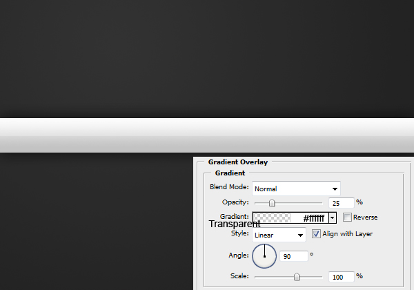
Apply the following layer styles to the navigation by right clicking it and going blending options.
Outer Glow
Gradient Overlay
Stroke
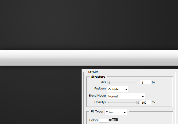
Result:

Step 4
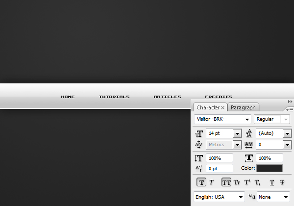
Now we are going to be adding the text for the navigation. Using the text tool add some text (aligned center).
Step 5
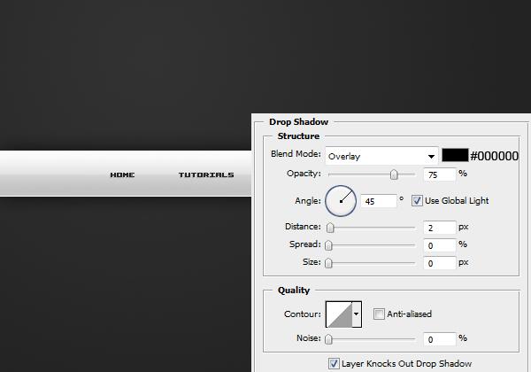
To give the text some depth, apply this drop shadow by going Layer > Layer Style > Drop Shadow.
Step 6
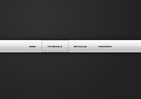
Lastly we’re going to be adding a hover effect to one of the links. So zoom in a bit on one of the links and select the rectangular marquee tool. Make a selection around one of the links like so.
Step 7
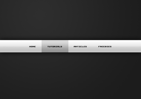
Fill the selection in with a linear gradient from #dadada to #969696.
Step 8
Apply this stroke by going Layer > Layer Styles > Stroke.
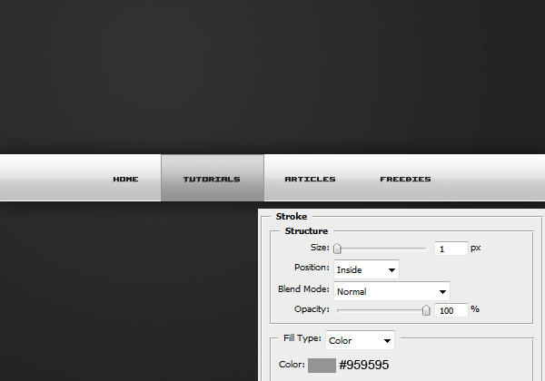
Step 9
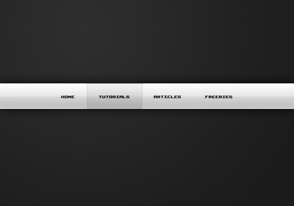
Set this hover layer to 40% and you’re complete! If you’d like to now learn how to code this into html/css then read this tutorial.


the flow of the work is very clear . thanks for such a detailed explanation ..:)
Parabéns, muito bom esse tutorial.
Simples e elegante.
VeryGood.
Very nice. Will defiantly be using this. Keep it up.
Thanks a ton!
Finished the tutorial just moments ago.
Cleared up some things on how things look, such as that slightly pressed in look due to the gradient and inner stroke.
Keep em coming!
i think it would better if you make other tutorial than web layout… thanks…
Yea I have a few tutorials lined up, but havn’t had much time recently to work on them. I’ll be focusing on other categories :)
id like to see some more decent tutorials from you guys, theres SOOO many navigation and header tutorials out, theres nothing really special about this header, doesnt set it a side from the rest.
maybe you should show us how to code it also?
This tutorial is aimed at beginners so if you are past beginner tutorials don’t bother reading them.
It’s just me writing all of the posts at the moment, and I’ve just started Uni so I’ll see how I go.
If you want to learn how to code it, follow the link at the end of the tutorial…
Great tut…nice work man…
Thanks a bunch. I’m total beginner, just preparing something for my mother and I will use this one for sure. Best Regards.
Great work man…I’m a beginner and it worked on me…
thanks man great tut
im gonna sign up for your premium membership
Great result. Looks really sleek and professional!
Hi, great tutorial, the only thing that isn’t clear is step 3 when you apply the gradient overlay, how do you set the gradient to transparent and white? Thanks!
Thanks. Click the gradient bar: the top pointers adjust the opacity and the bottom pointers adjust the colour. So set both colours to white (doesn’t matter about position since it doesn’t change) and one top stopper to 100% and one to 0% (both in the middle position). Read this tutorial for learning about shine effects with gradients: http://www.psdcore.com/tutorials/effects/shine-effects-with-gradients/
Great tutorial.
Very Good!!
This site is wonderful ^_^
Nice one
gr8 outcome…thanks