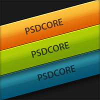
Classic Shiny Button
In this tutorial I’ll be going through how to create a shiny button, which if you’re a newbie, you’ll learn a lot about the basic tools and a few handy tricks with Photoshop on the way.
Step 1
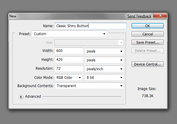
So firstly we are going to want to create a new document to create our button in. Go File > New and I’ve selected a size of 600 by 420 pixels to give us plenty of space. Also note that the resolution is set to 72 pixels/inch – this is the default for web designs.
Step 2
Now that we have our document, we want to have a dark background for our soon-to-come button. The easiest way to achieve this is to go Edit > Fill, using the colour #1a1a1a. Another method is to set your background colour to #1a1a1a and use the shortcut Ctrl + Backspace to fill the background with the background colour.

Step 3
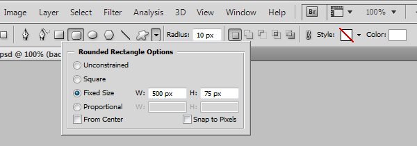
The next task is to create the base of the button – the general shape of it. We’re going to be using the rounded rectangle tool for this, so select it and set it to a fixed size of 500 by 75 pixels and raidus 10 pixels.
Step 4
Click somewhere in your document and this will insert the rectangle. We want this rectangle to be centered in our document, so select the move tool (shortcut V), select the entire layer (shortcut Ctrl + A) and using the icons at the top, center the layer. The colour of your rectangle might be black or white, we’ll sort that up in the next step – but the position should be like below.

Step 5
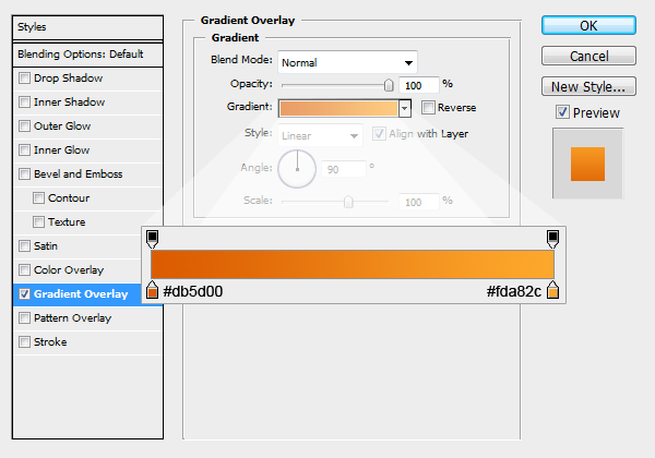
Now we’ll be adding a coloured gradient overlay to our button so it doesn’t look so… black or white. Right click the layer in the layer’s window and go blending options and go down to the gradient overlay style. To bring up the second window, you can click on the gradient, and then add the colours below.
Result;

Step 6
The next section of the tutorial is going to be focusing on how to create shadow layers to give the button some depth. On a new layer below the button select the brush tool with a soft brush about 65 pixels and 25% opacity. This first shadow is just going to run across from the bottom left to the bottom right of the button – so that you can see the bottom half of the brush.

Step 7
On another layer use the soft brush on a lower pixel setting – about 30 – and with an opacity of 40%, go over the original shadow. This is building up the shadow gradually to give more of a depth feel to the button. If you want you could add some more shadows and lighter sections around the button, but I won’t go into that for this tutorial.

Step 8
Now with in keeping with the theme of making the button as realistic as possible, we’ll be adding some shines and subtle gradients to the button. The first one involves us making a new layer above the button and adding a shine to the top half. To do this select the area of the button (shortcut Ctrl + Click the layer’s icon in the layers window), and using the rectangular marquee tool deselect (just like selecting except holding down the Alt key) the bottom half of the button.

Step 9
Select the gradient tool and with it set to white to transparent, fill the selection – start about four fifths of the way down and drag to the edge, this means it will fade out over the last fifth of the selection.

Step 10
Set the blend mode to Overlay and the opacity to 27%.

Step 11
We’re now going to be applying another shine layer to define the middle subtly. Using the technique in step 8, select the top half of the button and then fill with white (just like at the start of the tutorial, go Edit > Fill).

Step 12
Set the blend mode to Soft Light and the opacity to 17% for this new shine layer.

Step 13
Now we’ll be adding one last highlight to the button. On a new layer, select the area of the button and go Select > Modify > Contract by 1 pixel, and then Select > Modify > Border with a width of 1 pixel. This has made a one pixel border around the button, one pixel inside. Fill this selection with a gradient from white to transparent so you’re left with something similiar as to below.

Step 14
To make the highlight a little more realistic, set the blend mode to Overlay and opacity to 70%.

Step 15
The last step is to add some text to the button – so pull out the text tool and chuck some text in, remember to center the text just like we did the button at the start. The font I’ve used here is Myriad Pro, 30pt and the colour #543823.
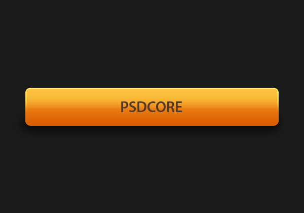
Colours
If you don’t like orange, or want a different colour, you can easily change the gradient overlay on the button and the text colour.
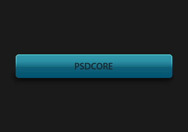
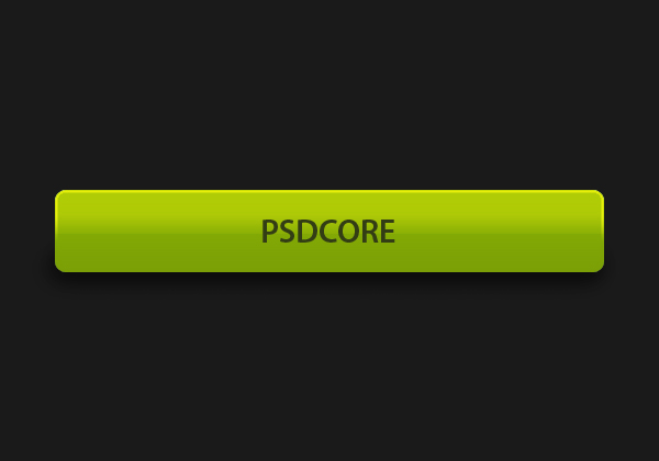


Simple, but nice tutorial.
Nice Button ….
Great tutorial thanks a bunch!
Good !
And a lesson!
Step 13 Don’t learn!!! =_=!
Well, once you have the one pixel selection around the button, select the gradient tool and apply a gradient from white to transparent in the selection. Which part can’t you do?
One way to do it instead of using multiple layers of effect to style a button, is by using the blending options on a single layer.
One can produce similar effects to the button produced above with the blending option. :)
Nice Tuts.. simple. :)